Building a Better Web for Humans
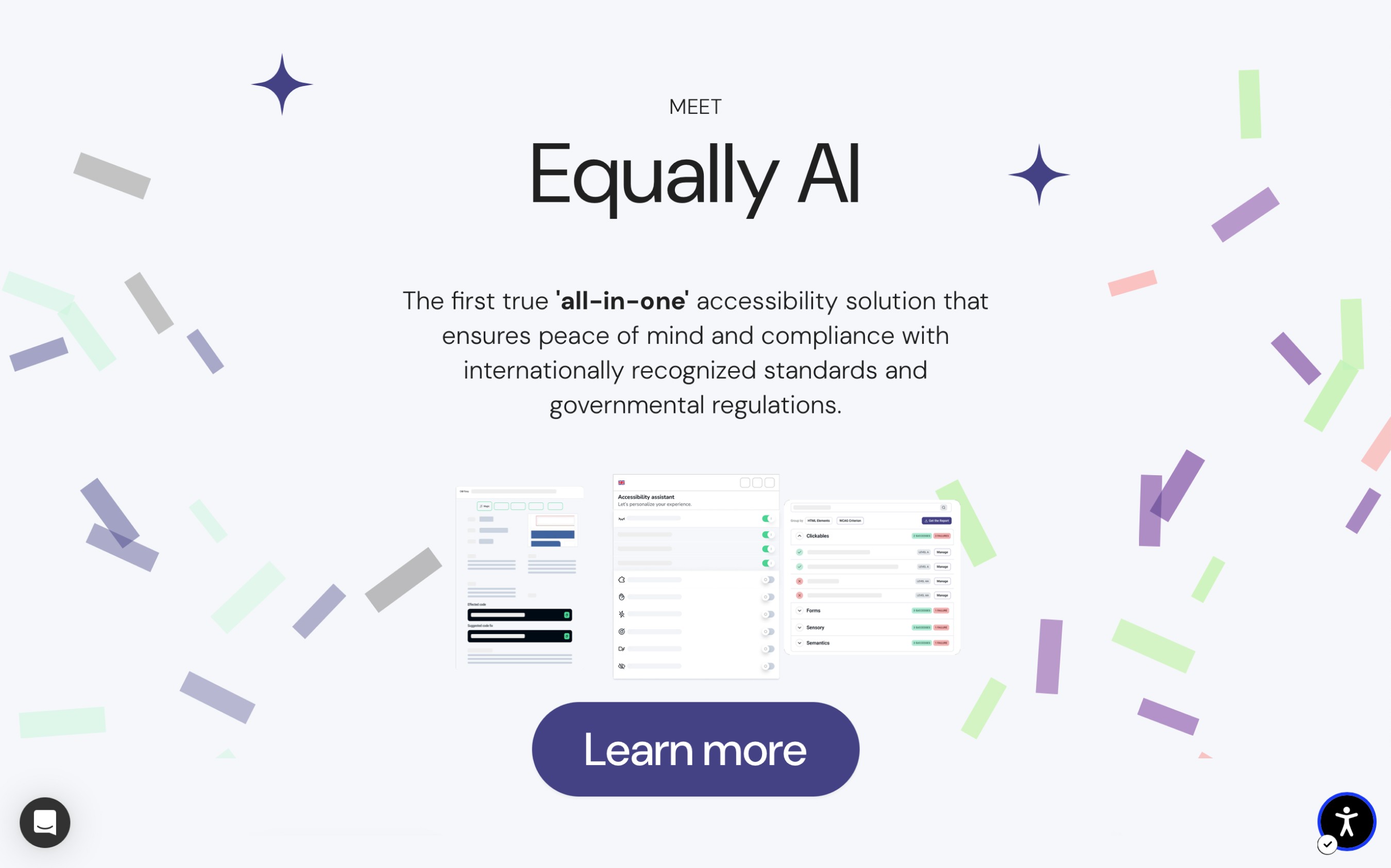
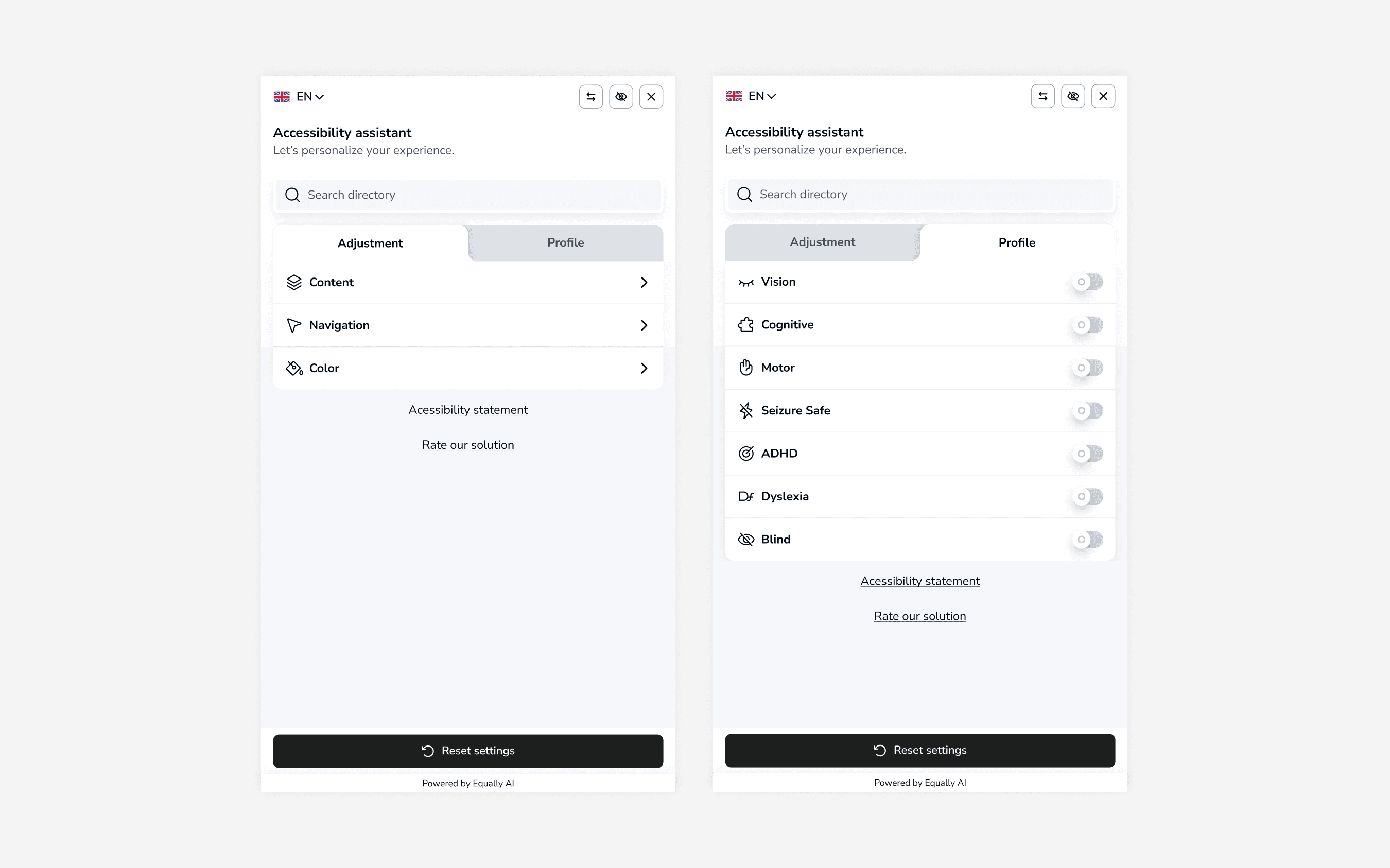
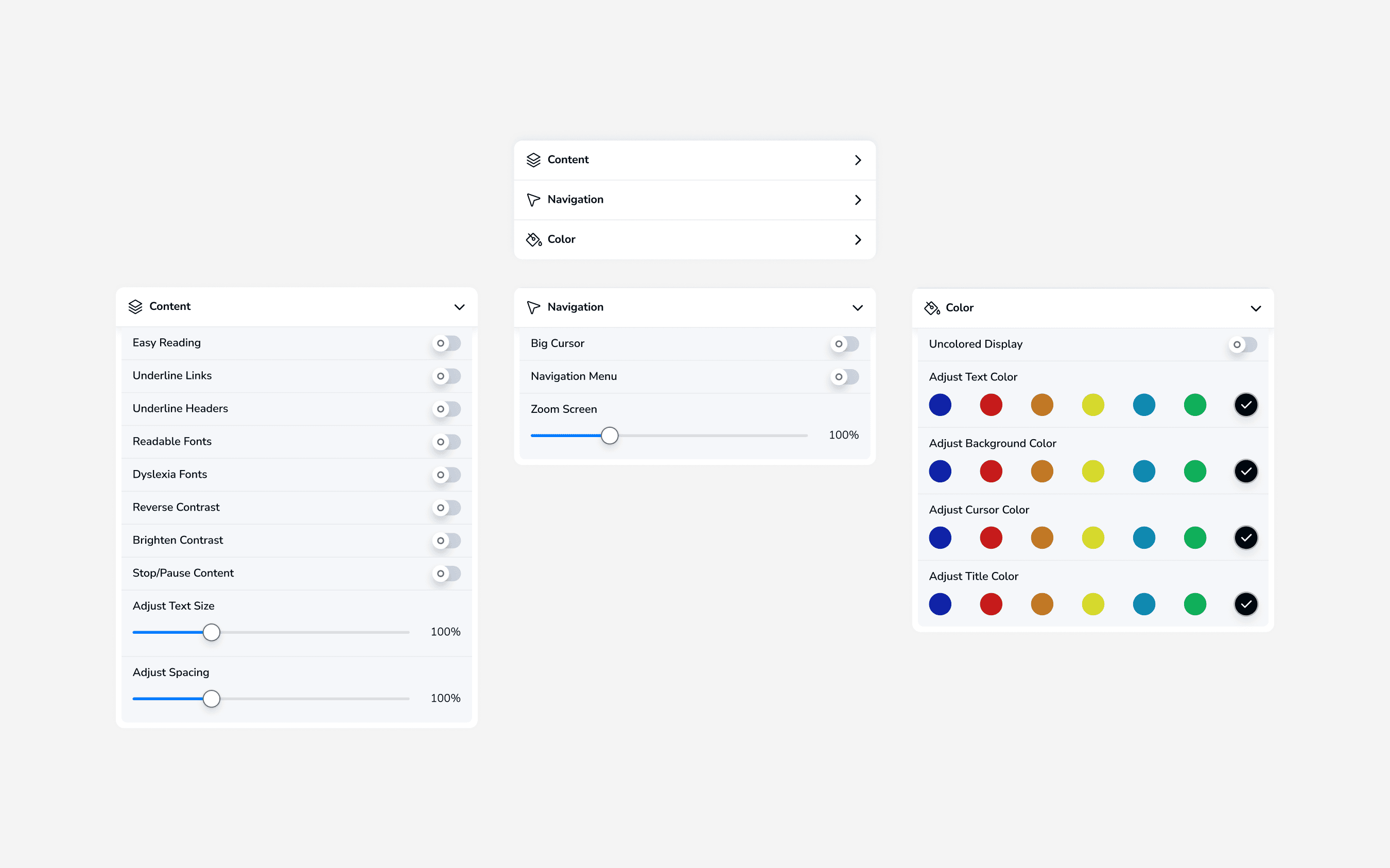
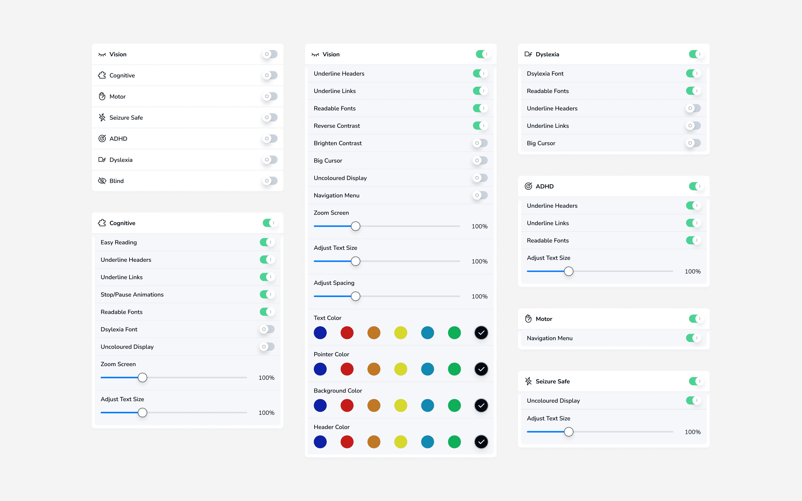
As the only designer at the time, I led the redesign of the Equally's accessibility widget to address usability issues and update its current look. The Final results introduced a visually updated widget with better profiles, a new tabbed interface and lightweight customisation options
A better web experience
Equally.ai is a company dedicated to making web browsing easier for people of all abilities by enhancing web accessibility, and ensuring websites meet WCAG and ADA compliance. They offer a customisable widget, which adjusts the website's appearance to meet the needs of a broader audience.
As the only designer at the time, I led the redesign of this widget to address usability issues and update its current look. This initiative was part of the company's effort to improve user experience, highlight its USP for better market positioning, and maintain brand consistency across all products.
Research
To further understand these core problems, we spoke to some of the stakeholders involved with the project, especially those directly in touch with the customers. They identified flaws following feedback from the clients using the current widget
It was clear that the current widget was overloaded with options and settings, making it difficult for users to navigate and use effectively.
Additionally, the content structure was poorly organised, lacking a clear hierarchy for how information was displayed. Essential settings were buried under layers of options, hidden 'below the fold,' and often overlooked.
Content organisation and arrangement significantly impacted how users accessed the widget's features.
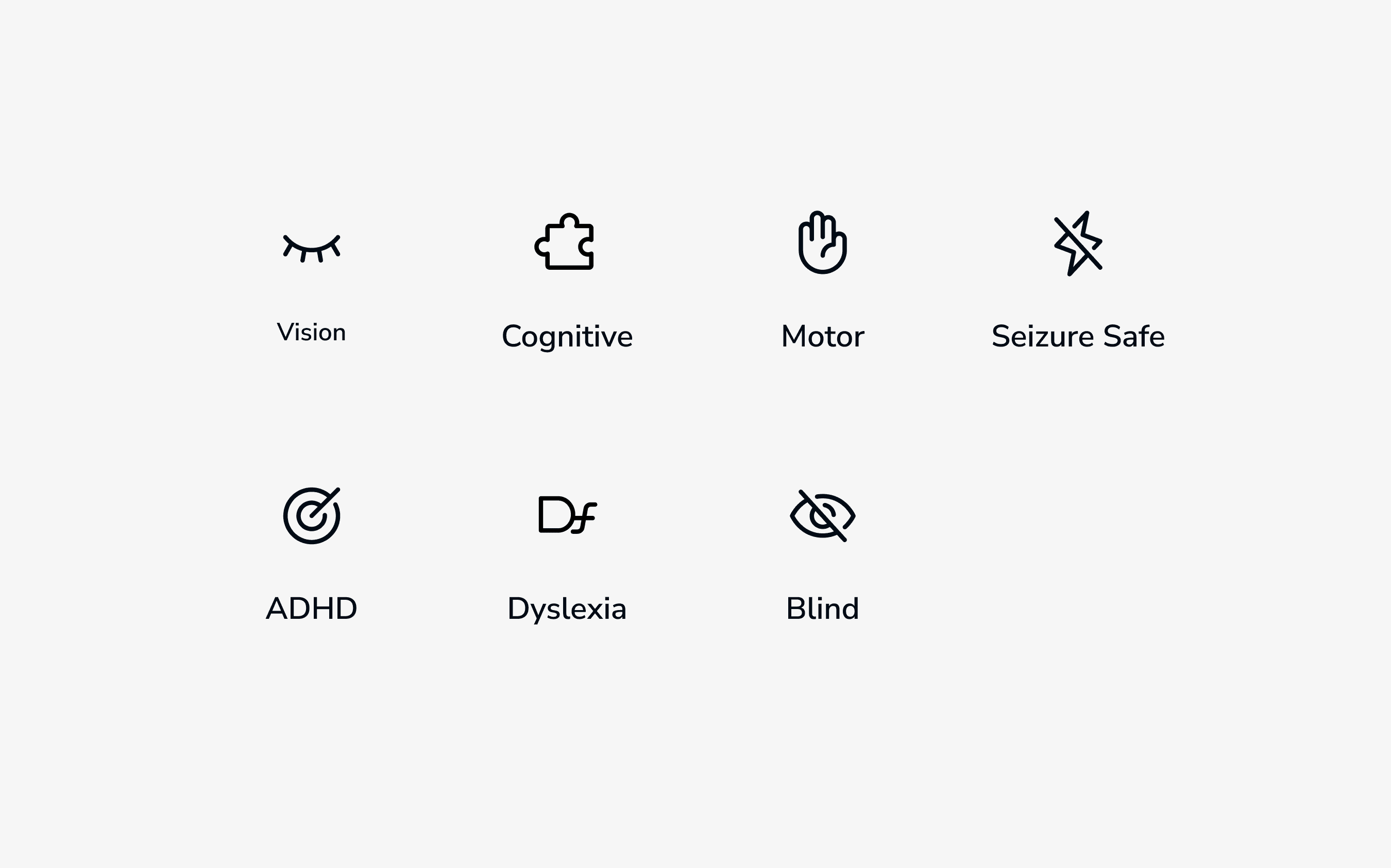
To better categorise information, we needed to understand the people that would be using it, and the range of abilities and expectations they have. We needed to establish some sort of base level of importance to settings. Introduce disability profiles.
We already had disability profiles although there was not much use of the product because it only had predetermined selections that could not be changed, plus the selection did not explain what changes had been made to the website
Design Process
Organising Information
One significant challenge was categorising the plethora of settings without overwhelming the user. Looking into how other companies handled long customisations. From direct competitors to more unrelated industries. We experimented with multiple organisational structures, from hierarchical menus to flat navigation systems.
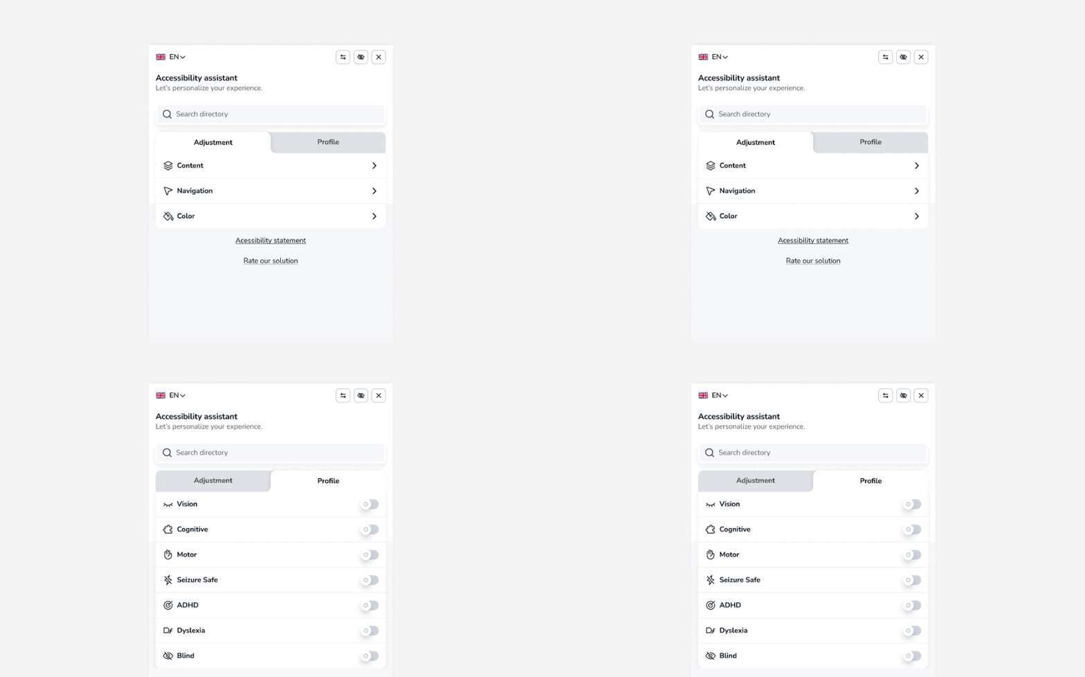
We introduced a tabbed system where users could navigate through different tabs, each dedicated to a set of related functionalities. This logical organisation allowed users to mentally map the settings for quicker access in future interactions.
We introduced preset profiles, allowing users to apply a predefined set of preferences with a single click, an idea inspired by observing user frustrations during testing.
Impact
After numerous rounds of internal testing and user feedback, the redesigned widget marked a significant improvement in usability and satisfaction Internal feedback alone provided a significant decrease in the time spent looking for options while testing with new and existing users. External feedback provided by clients was an increase in engagement in the use of the widget on their websites.
T.O.
Other Projects
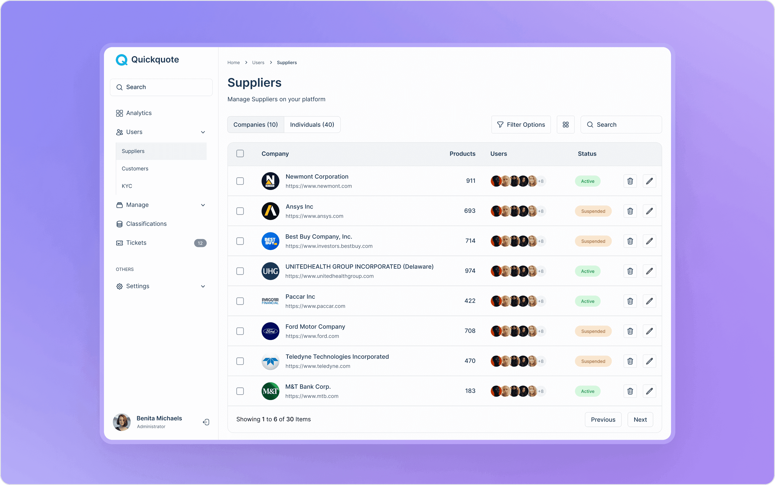
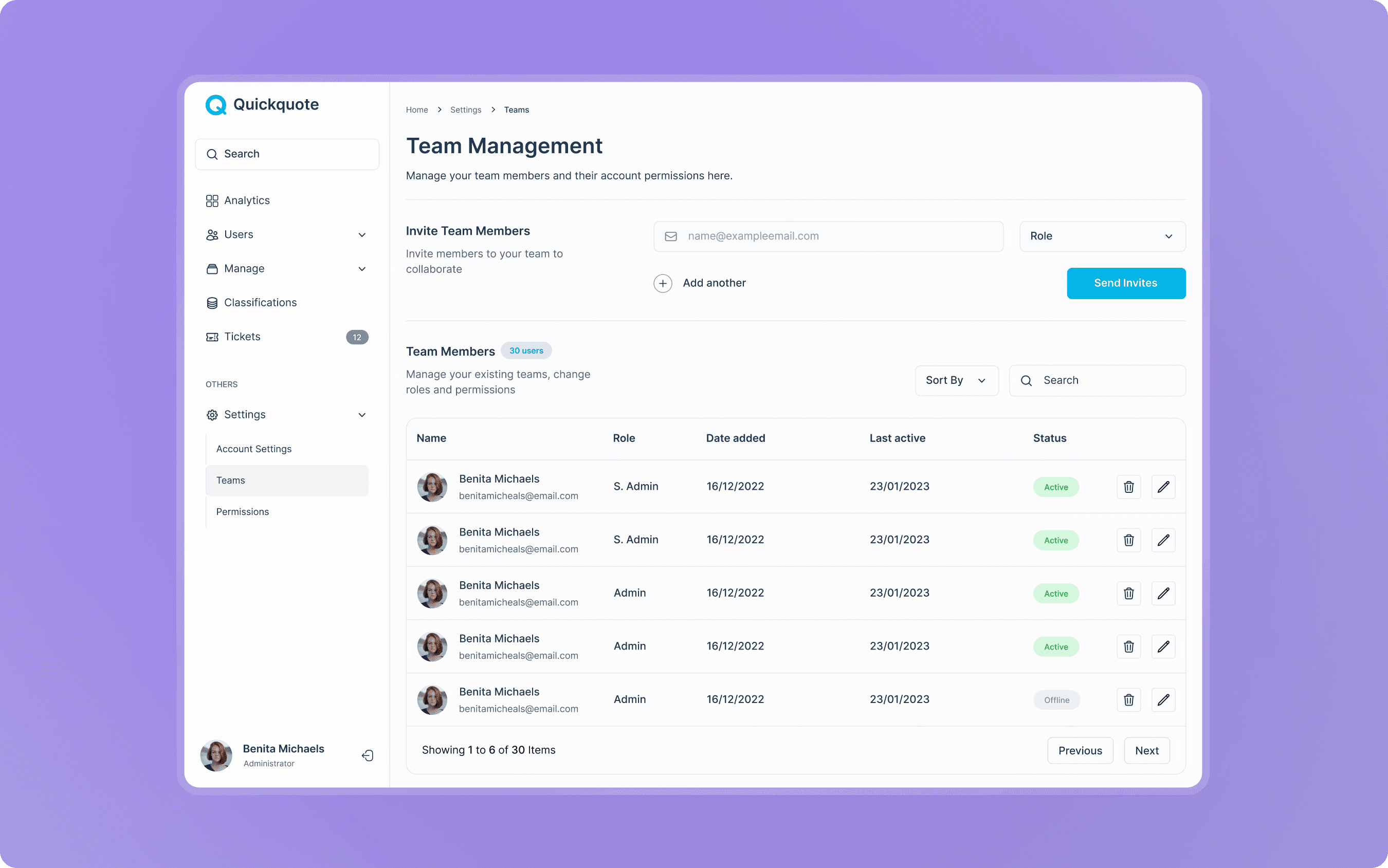
Better Dashboards, Better Admins
Collaborating with QuickQuote to create a dashboard interface for admins to manage interactions between clients on their order management platforms over 6 weeks.

